This is how I reviewed the process up to the point of formative assessment.


This is how I reviewed the process up to the point of formative assessment.
These are the final spreads that I submitted for formative assessment.


I really enjoyed the process of ideation, to fleshing the ideas out, designing and brainstorming imagery and creating the imagery, to then piecing all of the elements together to get this as my final outcome.
I really got stuck in with this project, and love how my pages turned out; however, I do think a block colour in the background of the 5th page would’ve balanced out the block colour background in the first full-bleed image — so I think I’ll go back and add that if I get the chance.
I think my colours work well together and compliment each other nicely. I wanted to make the piece look bright and inviting, but I needed darker tones for things like text, or for the bright colours to stand out from, so I was a bit worried about adding dark colours in case it didn’t work well with the imagery and the tone of the article I was trying to portray through the space and visual language etc. However, I think it ended up working quite well together. I think the colour palette is at its strongest here after revisiting and reworking the colour palette so many times.
I like that the coaster rings draw the viewer’s eye to key points like the headline, or the body copy. However, something I have only noticed now is the opacity on two of the rings is higher in the first two pages in comparison to the two double spreads that follow it — this will be something to go back and change if I have the chance.
I think the line length is a nice length to read and follow, and the rag doesn’t create too many distracting shapes for the reader. I did have some trouble trying to match the line length up to the column grid, and to stay within the grid.
I also think there’s a strong sense of hierarchy in my editorial piece. I think it works even more so with the colours meaning different things; for example, orange is the subtitle for each section — I like that I found out how to fit text around a corner (on a path), as it allowed my design to develop into something a lot more playful and interesting, without interfering with the system I had started to build and found was working for me.
I really enjoyed this project and discovered things I didn’t know how to do prior to this. It really encouraged me to be playful and push past what i felt was ordinary, and use them as inspiration to create a lot more designs that were a bit more dynamic and interesting.
I’m aware this is forward thinking, and it doesn’t entirely fit with the brief — but as I mentioned before, I’m really interested in a way that I can present this piece of editorial. I really want to emphasise the theme of community that is presented in the article. So in my sketchbook, I experimented with this idea of putting my editorial in a beer bottle as a way of packaging it, but in a way, the bottle also acts as a front cover.
I played with this idea a bit more recently:


Once I had an idea of where my project was going, and it’s typefaces, I started to work on the ‘branding’ or what would be the front cover of my editorial — these are just different layouts using my two typefaces and my Hirameki imagery.


Then I started to think of how the editorial could be closed up so it actually holds its shape in the bottle and doesn’t start to unravel at the top — so I looked at stickers as a way to seal it, which gives it this sort of invitation feel, which also works with my subtitle “Inviting the community around for a knees-up and a brew”. The other image is just playing around with my two favourite layouts from the sketches, and trying to get a feel of what they’d look like on a bottle.
I don’t have any photos from the Glyph workshop because I was trying to keep up with the instructions.
I found this workshop to be really difficult — interesting, but really difficult.
I love the idea of being able to design my own typefaces at some point; however, it just wasn’t working for me in this session. I picked the wrong brush to work with, so some parts of the brush stroke didn’t register when it came to creating the letterforms in Illustrator, so the letterforms weren’t entirely readable.
In addition to this, when it came to putting the letters into Glyph, the software didn’t like the letter ‘t’ I’d created for some reason, so I couldn’t export it to actually be able to test and use it in Word as planned.
I learnt that I need to pick brushes that are solid black all the way through, because some of the brushes in the brush library have a varying opacity, which meant that Glyph wasn’t picking it up properly, or it looked nothing like the letterform once it was made into an outline.
It was still a really interesting experience and very different to everything else we’ve done so far this year, and I think I might revisit Glyph at some point and try to work out what went wrong the first time.
In my previous post, I wrote about my second workshop in screen printing, and I made some Hirameki drawings from these.

At the time of our screen printing workshop I started to think of the possibility of screen printing my entire editorial piece, I wanted to see if the imagery would work with this printing method, and I think this proves that it does. If I was to ever do it as more than just a playful experiment, I would print all the colours separately, instead of risking them becoming a colour blend — although it did give the annotated illustration an emphasised expression, so I think colour blends could be used, but intentionally and not for all pieces of Hirameki.
I really enjoyed this screen printing session, and I definitely learnt a lot more in this session. One of the key things I learnt from this session is I can screen print Photoshop/Illustrator/Indesign files into layers and screen print them. I’m really interested to find out what text prints like, and what effect screen printing can give it — I wanted to screen print my editorial, but my typeface has such a narrow weight I think it would’ve disrupted the legibility of the content massively.

Coating the screens with photo emulsion ready to expose our images onto.


Exposing the images onto the screen.

The images I exposed onto the screen.

My images on the screen.


Watching the process of printing onto acetate, checking the placement of the paper, and making registration marks. This is one of the things we learnt in our first session in screen printing.


Making a colour-blend print.
I realise I made a mistake of not drawing the piece in layers, which meant that if I wanted to work in two colour I needed to do a colour blend. I like how this turned out though.


Printing shapes for Hirameki experiments later on.
I felt like the easiest way to print this would be to treat it like a colour blend; thankfully, for the most part, each shape was only printed in the one colour planned for it. Obviously, as I moved the squeegee, the ink started to create more and more of a colour blend — this was okay though as they were for experiments with Hirameki, so they didn’t need to be perfect, but if I was to do this properly I would definitely print each shape separately to avoid colours blending together.


I’m really happy with how the two things turned out.
The key thing I will take away from the session is to work in layers, and allow for colours to build. Because these were all one layer designs when I drew them out on acetate, it didn’t really give me any room to build and play with the design and the layers.
Throughout this project I’ve experimented and developed on different presentations of Hirameki art — I’ve tried creating Hirameki through tactile means, digital techniques and I’ve tried combining the two. In a recent post I discussed that I wanted to make my Hirameki pieces digital, because I felt it was the best way to maintain a consistent visual language.
I chose a few images from my further Hirameki experimental pages to turn into digital illustrations for my editorial project.


This last image is the only one I really changed. I felt that my Jenn Merrick illustration should be in the centre as she is the founder of Earth Station Brewery. In terms of the other characters, I didn’t want the men together as it looked like I had group them off and isolated them from the females. In addition to these changes, I just played about with the scale of each person — this is because the height of the Jenn Merrick illustration made me imagine her to look younger than she actually is, and I didn’t want the audience to get the same impression. I also played around with colours a bit, like making the colour of Jenn Merrick match the colour of the illustration next to the standfirst, just to create some sort of consistency throughout the piece.
There weren’t many things that needed changing besides moving my text to work with the new column system, and adding elements such as page numbers and a subtitle, and things like page names.


Page Numbers


When it came to things like page numbers, I realised after doing all of my sketches that I didn’t want anything too minimalistic that didn’t feel cohesive with my — already very simple — imagery. so I decided to go with the idea of a beer droplet, they’re still a nice shape to highlight the bottom of the page, and match the drink ring imagery.

I just rotated this shape to different degrees in the editorial so the shape looks relatively different on all of the pages — I wanted to avoid creating a different shape for each page because I felt that at some point soon into the process I’d run out of ways that would make it look simple, not completely circular and not invisible (in a sense that it doesn’t look like a key part of imagery). Additionally, I decided to keep it the same colour as the coaster rings to make the design look more visually cohesive.
Subtitle.
I wanted something that would show the audience that this brewery was for them, and was gifted by the brewery itself. The brewery have opened their doors to the community, and the article relies heavily on that friendly tone of voice, and I wanted the subtitle to reflect that.
I played around with the idea of it being a taste for everyone, or about the people — for some reason I felt that they sounded like parts of manifestos, which felt like it was steering off into a more communist sort of voice. In the end I settled for “Inviting the community around for knees-up and a brew“. This, for me, encompassed everything the article had talked about; my main focus was that I wanted it to feel like a very informal invitation, so it creates this essence of friendship for the viewer. Additionally, I wanted to play around with the word brew — it works in context with the article because it’s about a brewery, but it also creates that element of friendship again because it also sounds like they’re inviting the community over for a cup of tea and a chat, which is what really encouraged me to pick this idea.
Page Names
I thought if sectioning each page, but that didn’t really make sense because each paragraph already had a suitable subtitle — I think if I’d used both it would’ve appeared cluttered, and that i hadn’t really thought out my design properly. Additionally, by giving each page a different name it felt like I was isolating things into groups and not allowing it to work as one thing together. I decided to use ‘Draught Includers // 2018′. This shows that although each paragraph is different, they all come under the same story — or in context of the people, each person is different yet they all come under the same brewery and community — which I thought was a nice way to keep it simple, yet effective.
This is the bottle imagery that will be used in my editorial. It’s been reviewed from sketches and colour mock-ups, etc. in order to make it a stronger piece.

I realised that I had this image on a low opacity, which meant that its possibly other colours could show through the outline. To fix this, I took the image into Photoshop, colour sampled it, and then but the CMYK values back into the image in Illustrator which made it the same shade as the lower opacity version, but it’s now at 100% opacity so other colours won’t interfere with it.
I then filled in the walls in the nearest colour in my palette that could possibly replicate beer. I didn’t want to use any murky colours that could be used to show the beer because it disturbed my bright and exciting colour palette. I thought orange and a mid-blue tone would be nice together as they are complementary colours, but this also meant I could use the more exciting colours like the teal and pink for the inner workings of the bottle.
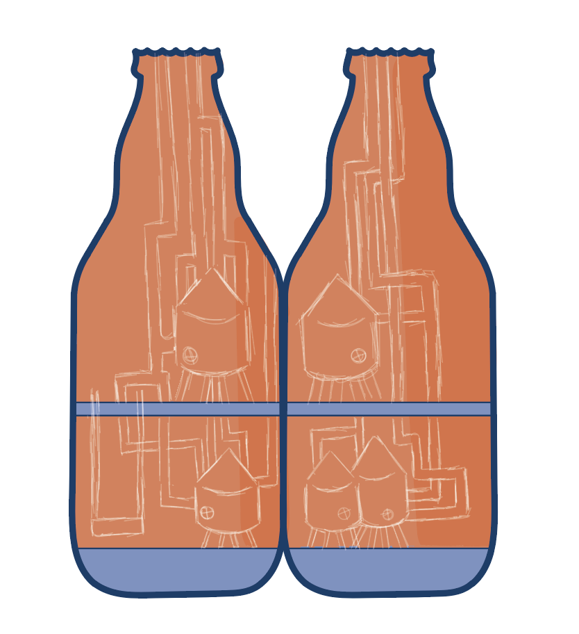
I then went from the design in my sketchbook, and my initial digital design, and started to add in the outline so it would make adding colour easier.

This is the design with all of the brewery pipes drawn in. I wanted them to look bright and interesting, but I also wanted to give a nod to women working in a male-dominant industry — which is why the pink entangles with the two (stereotypically) blue colours for men. However, I think I did a good job of not making it that obvious, so that it wouldn’t cause potential arguments around gender status and stereotypes, etc.
I wanted to add a small amount of tone into the piece so it doesn’t look so flat, hence the two tones of orange on the walls. I thought it would be nice to add in some tone on the brewery tanks, to try and emphasise their shape, but without making the entire piece look 3D.

This is the first layer of tone that I added. However, after some reflection I felt that the two tanks at the bottom (right), and the one above it needed a bit more tone as that side of the bottle is darker, so naturally, we’d expect to see me tone there.

I decided to use a slightly darker shade of the lilac for small details like defining the taps and the legs of the tanks — just to emphasise the shape of the tanks a bit more.

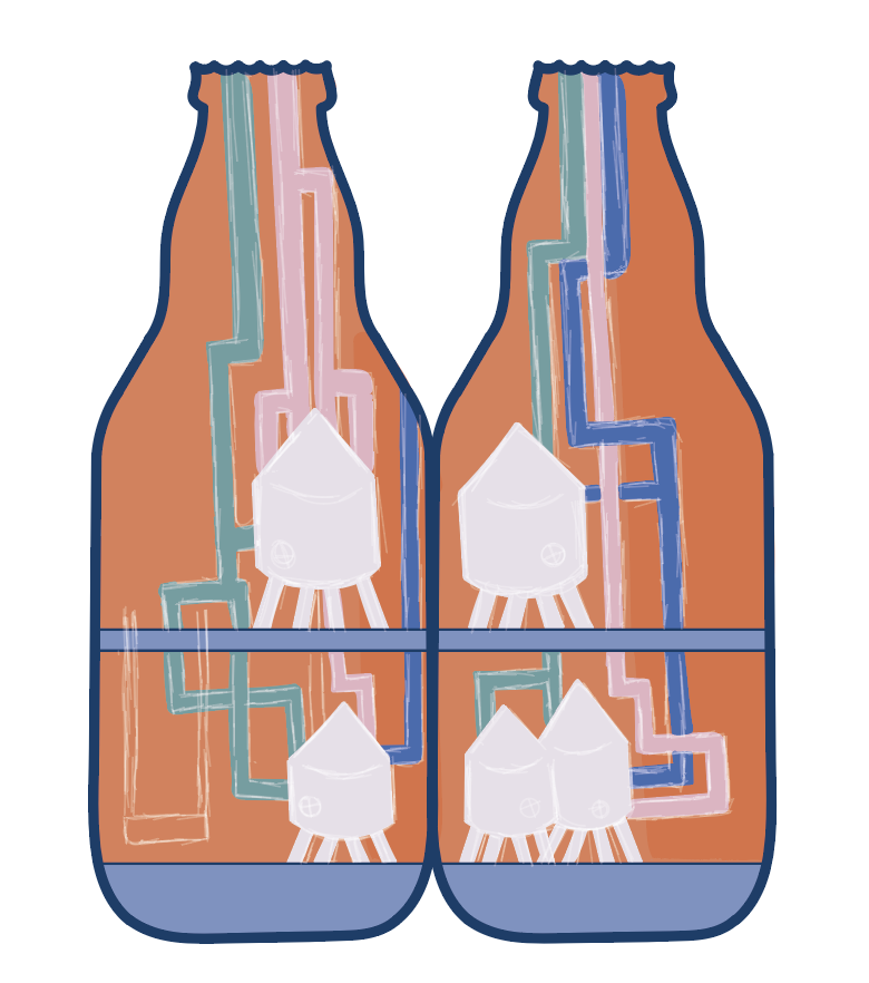
After reviewing the designs I had in my sketchbook, and my mock-up digital design, I realise that it didn’t really suggest it was accessible to everyone’s abilities, or disabilities. So I decided to illustrate something that gives the impression of a lift (for those with disabilities) and a ladder (to show it has a diverse range of workers and abilities within their team).

This is the finished piece. I decided to add a darker background, to allow the bright colours in the centre to really pop, and draw the viewers’ attention in closer.
Overall, I think this illustration turned out well, it went through many colour experiments and sketch reviews — I think this is way stronger than how I initially imagined it. I like that it has elements of depth, but doesn’t make it look overly complicated either.
The only problem I had was with the colour palette. The colour palette I made a post about previously, didn’t really create the expectations I had for the final outcomes of this illustration. This is because the purple shade I had chosen felt way too cold in comparison to all of the other colours I had use.


All I did was change the shade of purple to a slightly warmer, shade with more of a red tone than a blue tone, which I think looks a lot better as the warmer shade looks a lot more inviting.
This is one of the videos I watched to help me work within the Hirameki part of my editorial. It taught me to be playful with the drawings, and not focus too much on what they actually looked like.
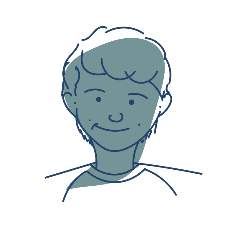
Graham Shaw did a TEDTalk surrounding the idea that people think they can’t draw because they can’t create masterpieces that are worth millions. He teaches them the basics of drawing cartoons.

Here, he shows them how easy it is to draw basic shapes to create a face. He uses thinks like speech marks for facial features, which people can definitely draw. This video is all about using people’s current knowledge of shapes and how to use that to create small illustrations. From the sound of the audience, they all sound really impressed with how they’ve done.
There’s this idea that if you can’t draw somewhat realistic images, then you can’t draw, but it’s all about the character that you give the drawings that connects with the person. I discovered the same with Hirameki. It wasn’t so much the drawing itself that mattered, but more about the character, and how the shape built up the illustration’s personality.
It turns out, the more playful I was with the illustrations, the more I felt drawn to them — I think this was because they weren’t intimidating pieces of work, because it was all about basic shapes and line work.
