When I went to my one-to-one critique, it appeared my logo still needed some developments and that I need to use my marque more within my logotype.
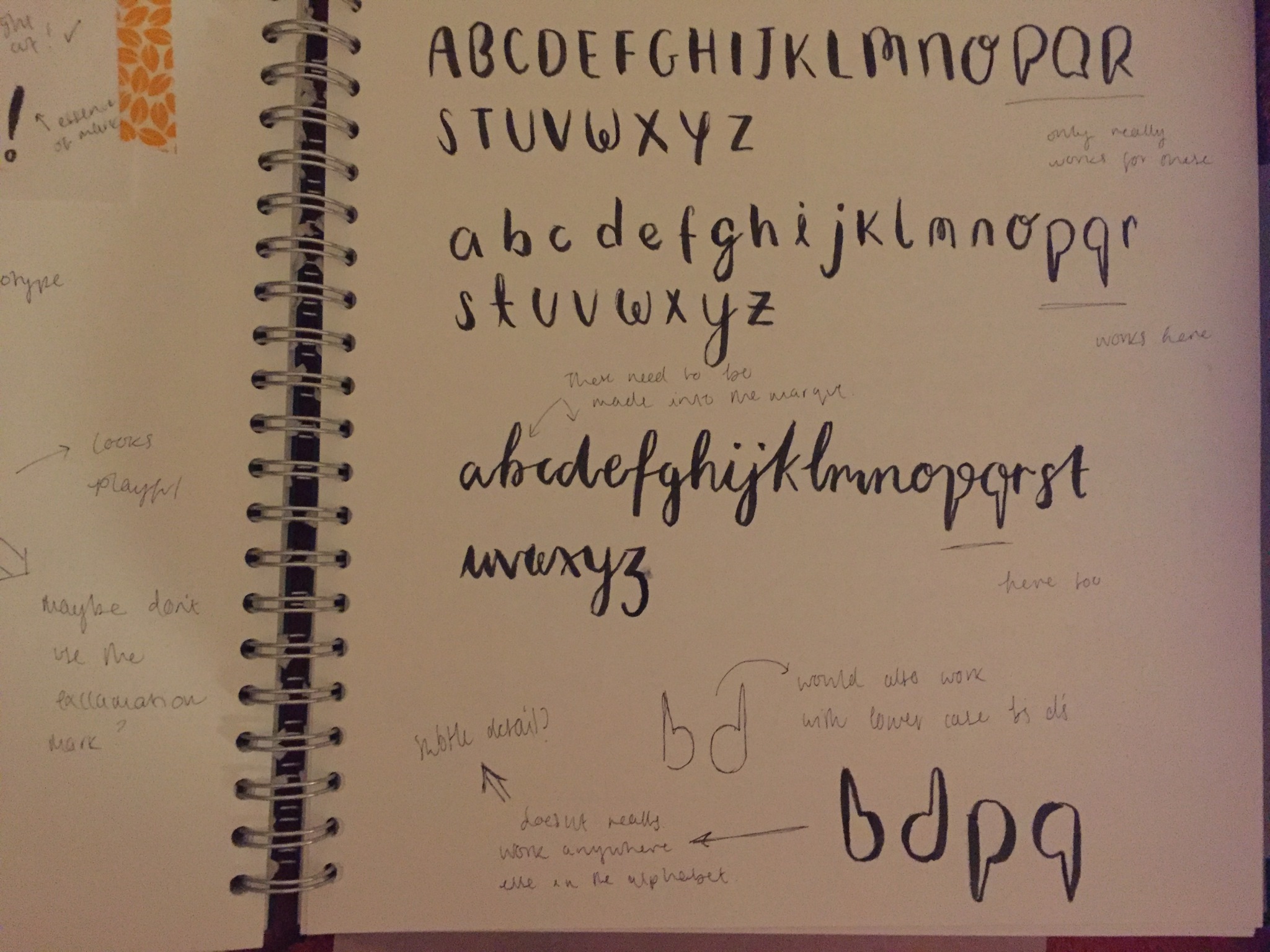
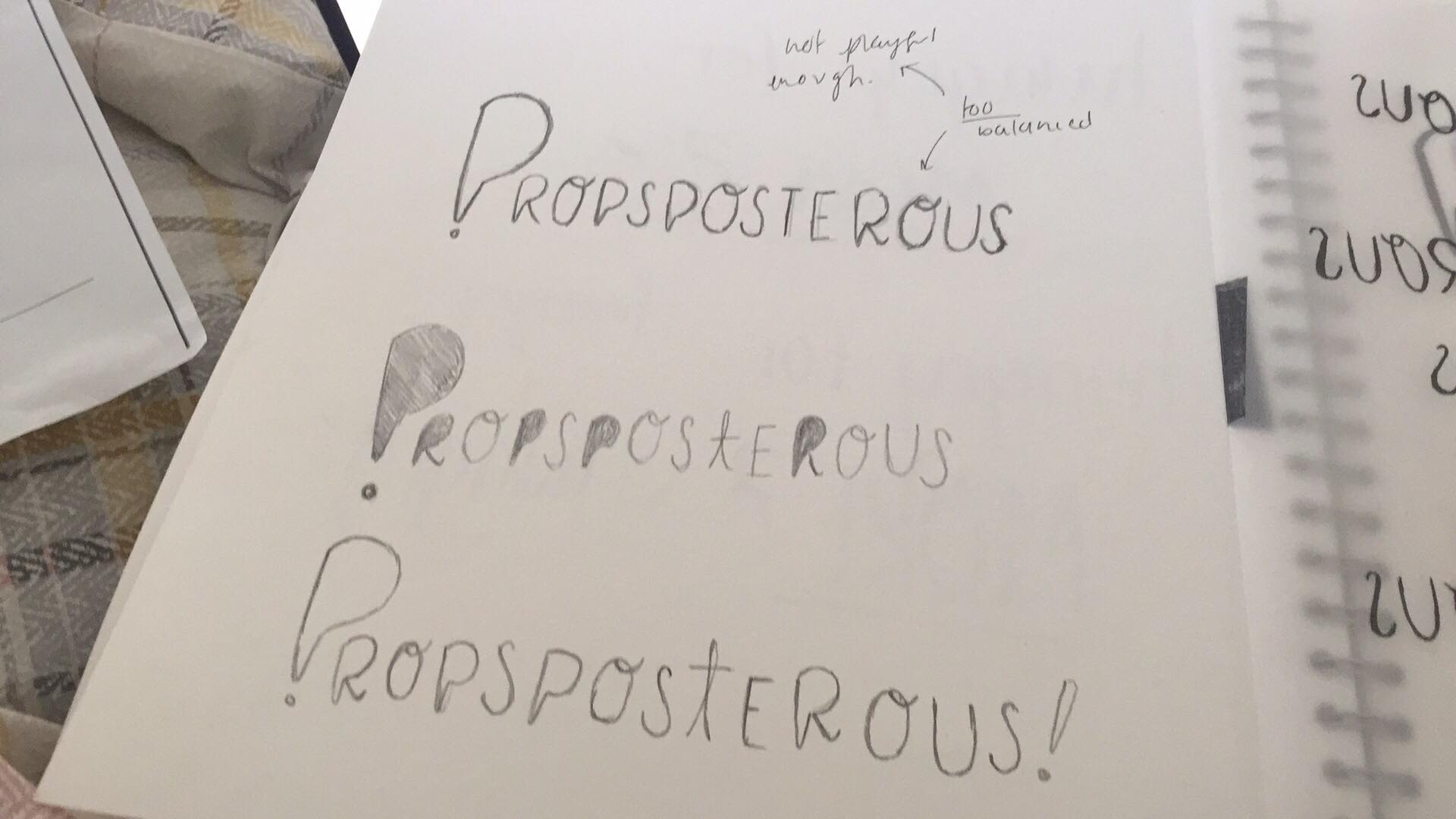
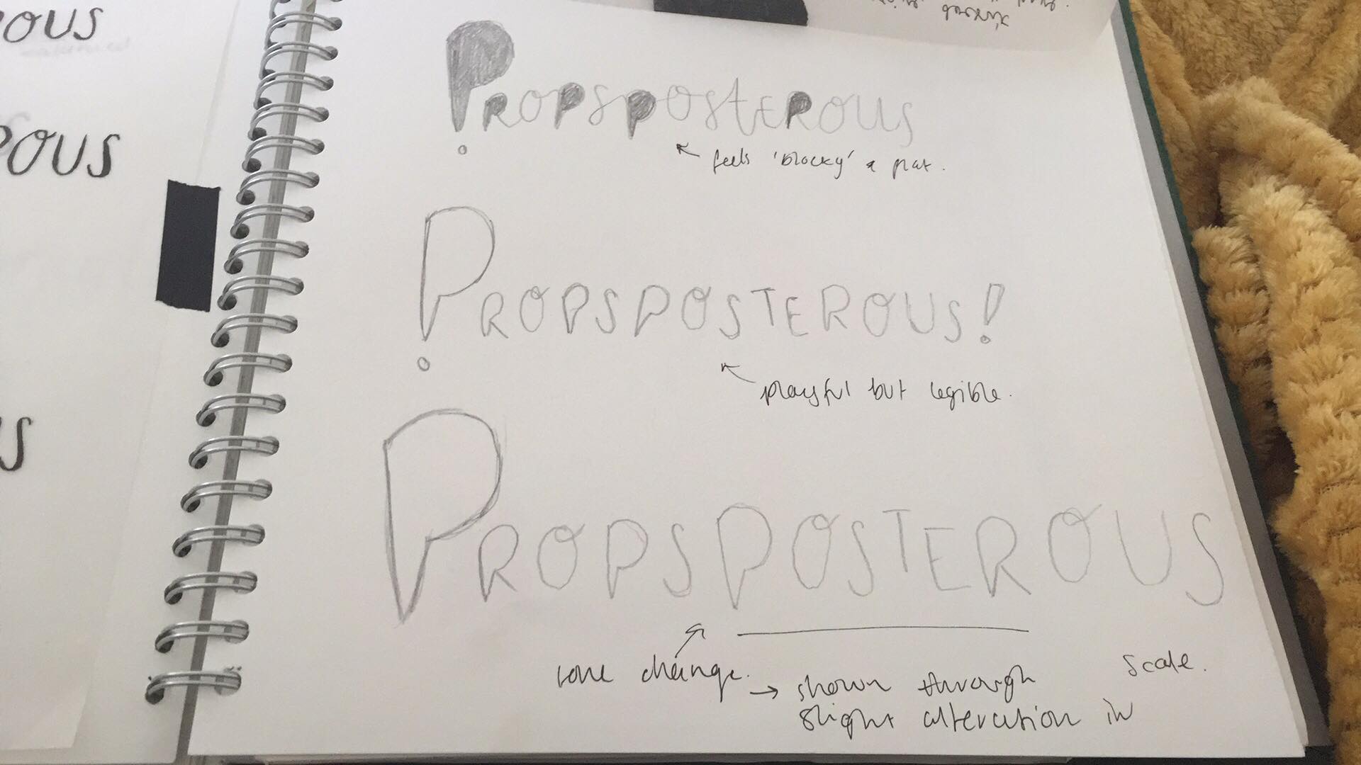
When I went away from the session I sketched out six new logotypes, all in a similar style but with minor tweaks. I used these six sketches, and went over elements of them with a brush pen to come up with more logotype designs.
After doing this, I picked my four favourites and re-did them in yellow. I did this so I could see them in the logotype colour so I could have a better idea of what they would look like.
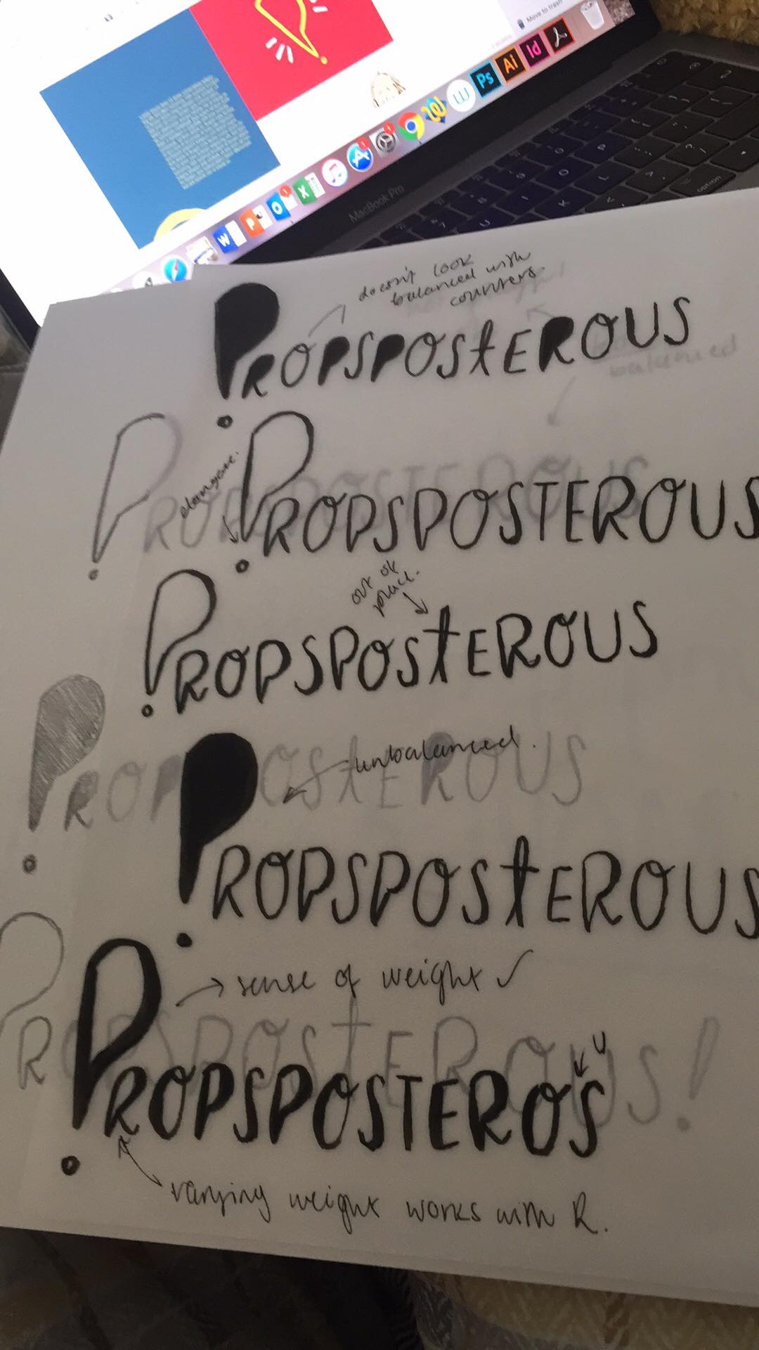
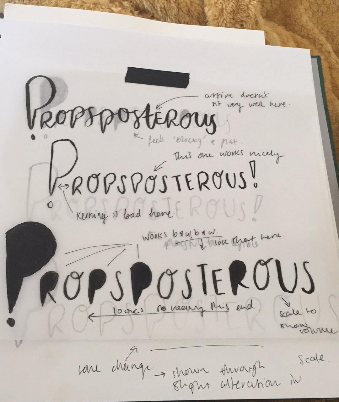
I ended up mixing the third and fourth yellow logotypes together to come up with my final logotype
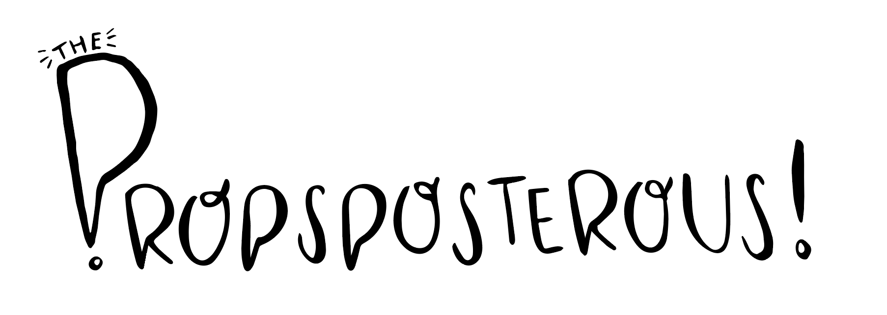
I really like this logotype and I think it sits quite nicely between my first and second logotype ideas.
In addition to developing my logotype even further, it was also suggested that I try using the exact marque to create my illustrations.
I wasn’t convinced with this idea, it just didn’t feel right to have everything looking the same shape. I went and tried it to see if there was anyway I could get the idea to work
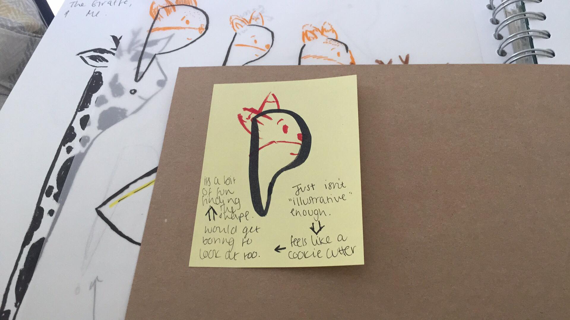
So the idea was to have the marque really strong and then have the details drawn on in a different colour. This still didn’t have me convinced, so I tried to see if I could manipulate the shapes slightly to see if that would work.
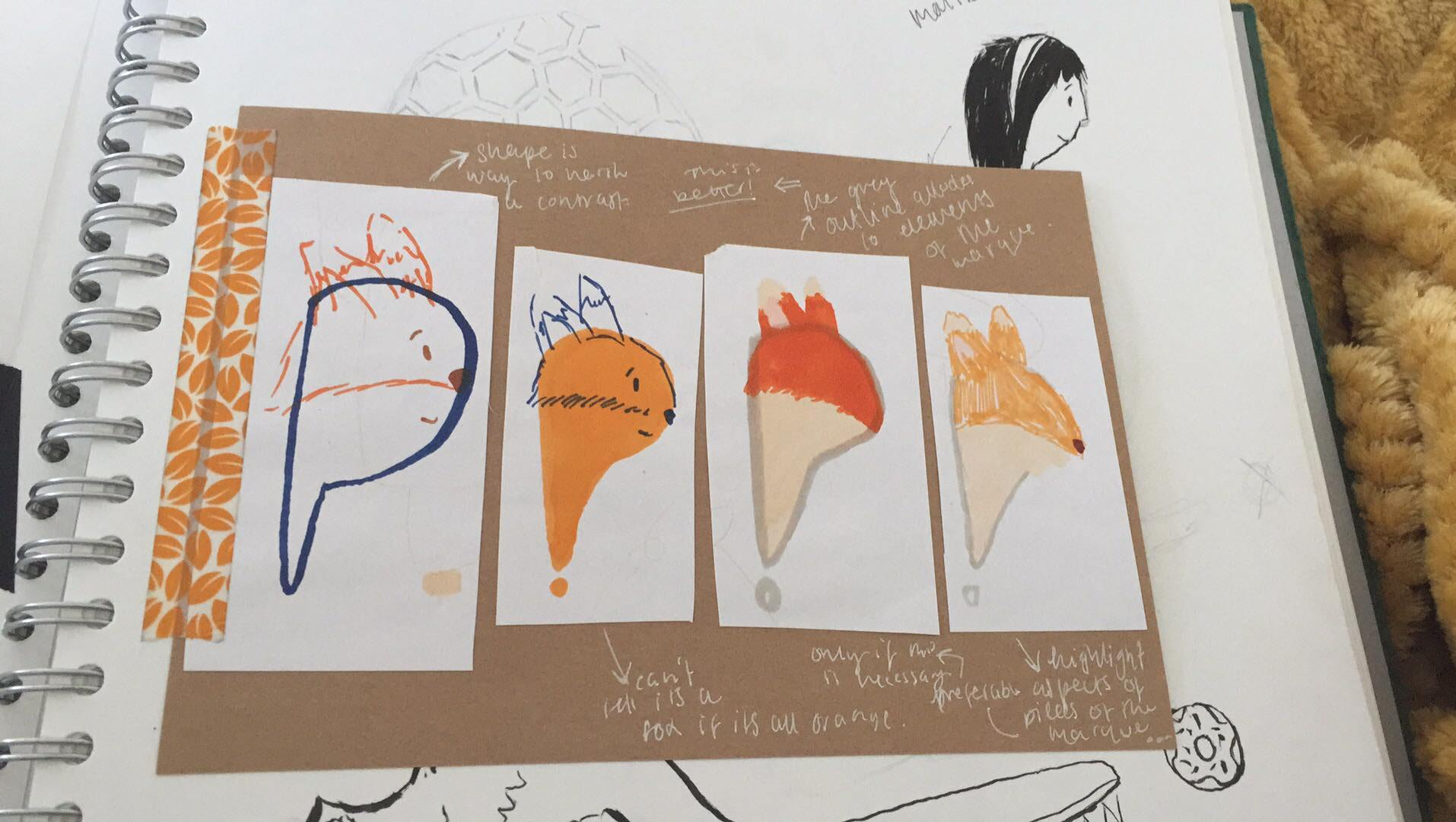
I tried some quick outcomes but however I tried to manipulate the shape it just didn’t feel like it was working for me.
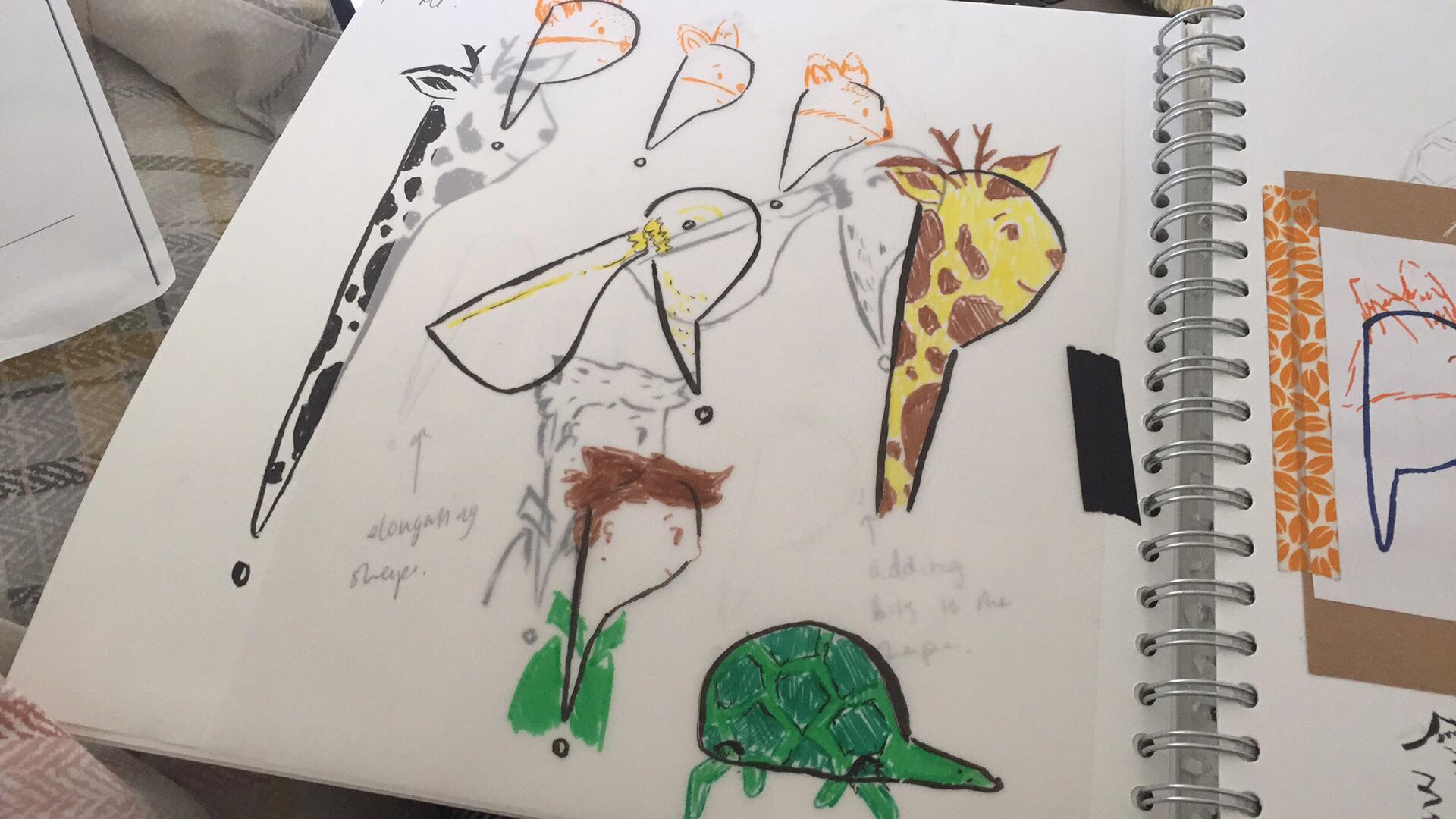
I tried it with some of the other illustrations, thinking that a fresh angle on it would change my mind, but they didn’t feel as playful. I think it takes the life out of them, especially the tortoise. It looks like I’ve forced it into this shape and loses its expressive nature.
I tried again using markers, thinking that possibly the block shape but coloured in to look like the illustrations would work.
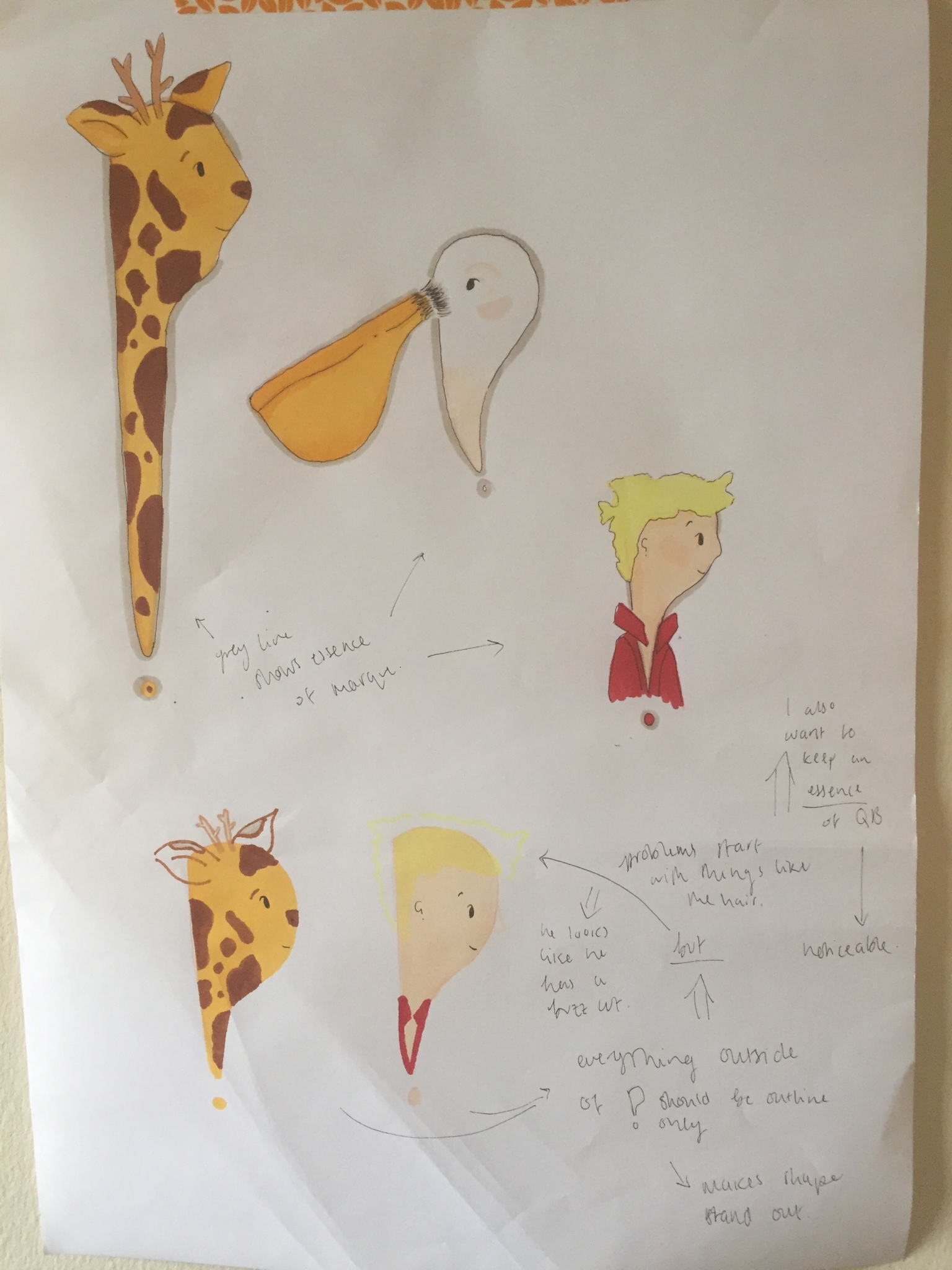
I think I’m going to stick with my original illustrations because the developments don’t feel as playful and expressive.
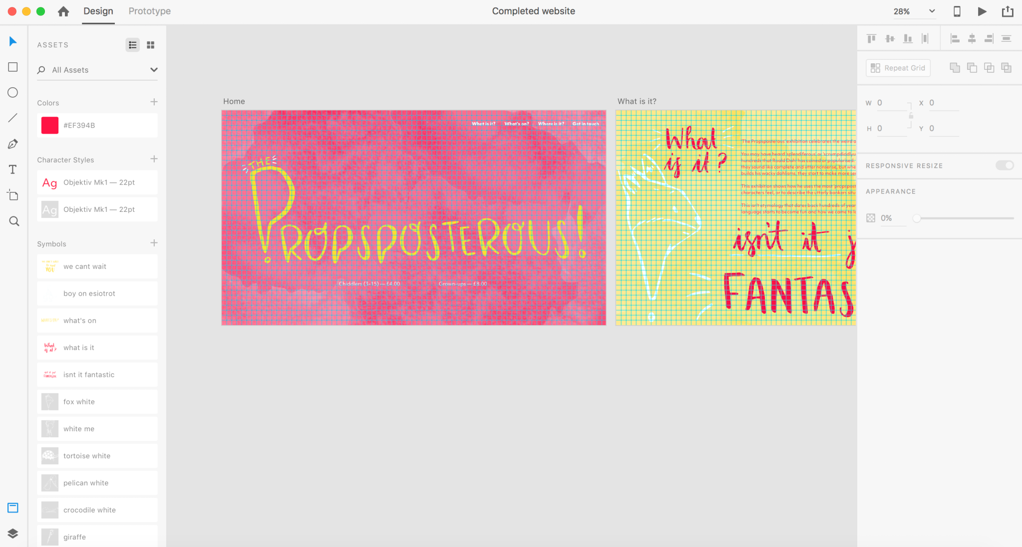
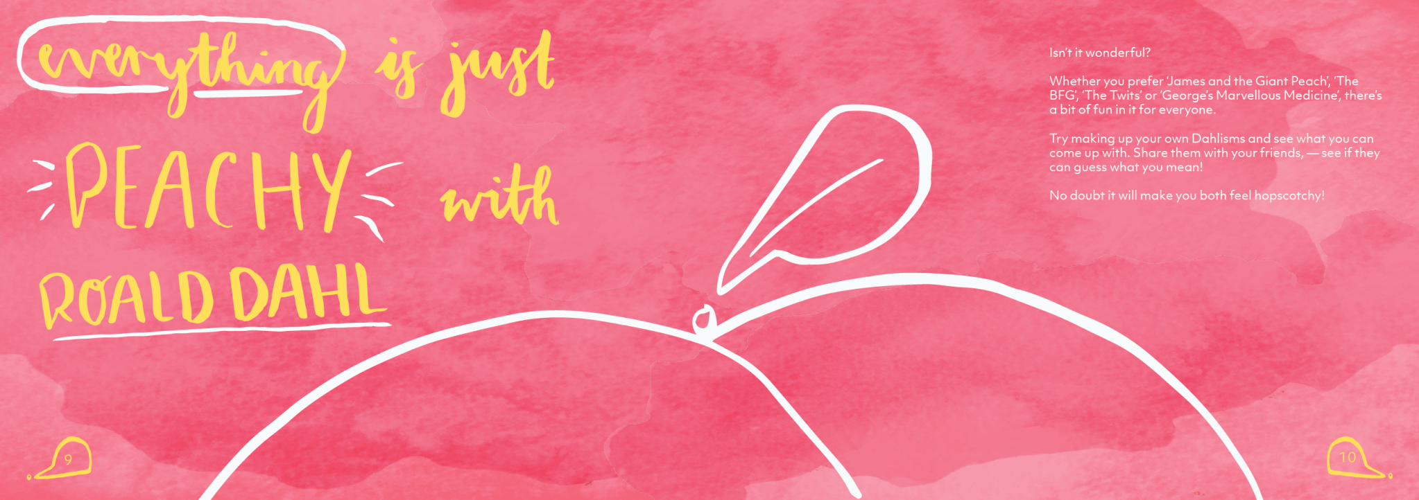
Going back to my last LJ entry, it was agreed that my layouts felt flat and lifeless, so I need something to give the page more dimensions and to make it feel more dynamic; in addition to this, a textured background would again emulate the style of Quentin Blake.
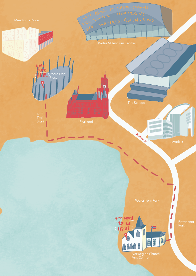
This is what I came up with:
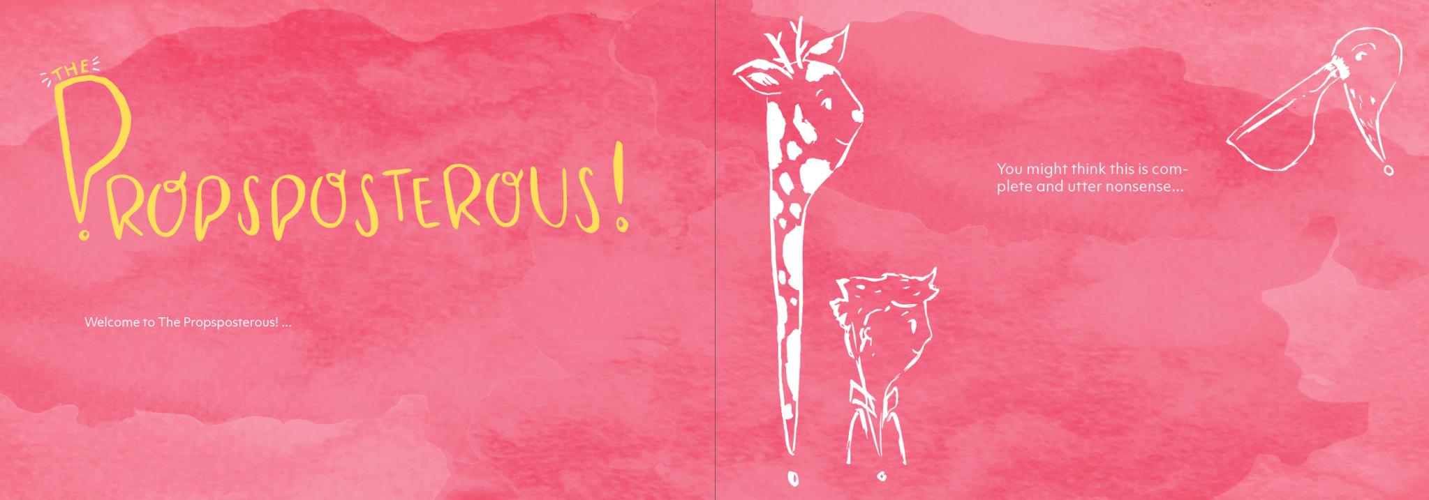
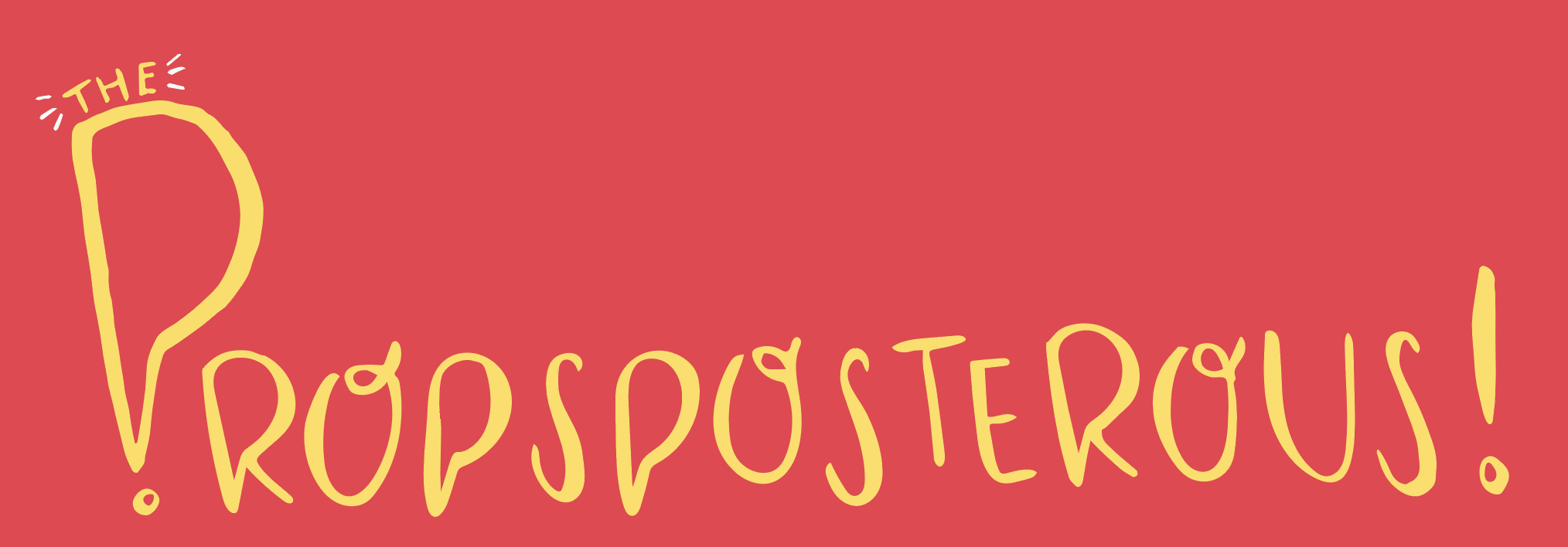
I love how this looks. I’m still developing the layout and playing with scale, so I don’t have anything to really show on that yet, but I’ve put the new logotype in to show how it works in context.
I tried for so long to get the texture right. Initially, I painted sheets with a full watercolour texture with the plan to just edit it in Photoshop and then copy it into Indesign.
I thought by using a cool tone and warm tone I could also get different effects and layers in the texture, but these didn’t work due to the paper buckling. The buckled paper caused the light to show up in some areas more than others, which stripped away some of the texture when I put it into Photoshop.
I decided to try again but make a smaller texture in black and white. I realised that by doing it in black and white I would see more of the watermarks and veining in the texture; in addition to this, I realised I could just used the same texture but layer it and alter it in Illustrator to create different watercolour textures each time.
I colourised the texture in Photoshop, with the red from my colour palette, after playing with the levels and the curves. This created the texture on the right.
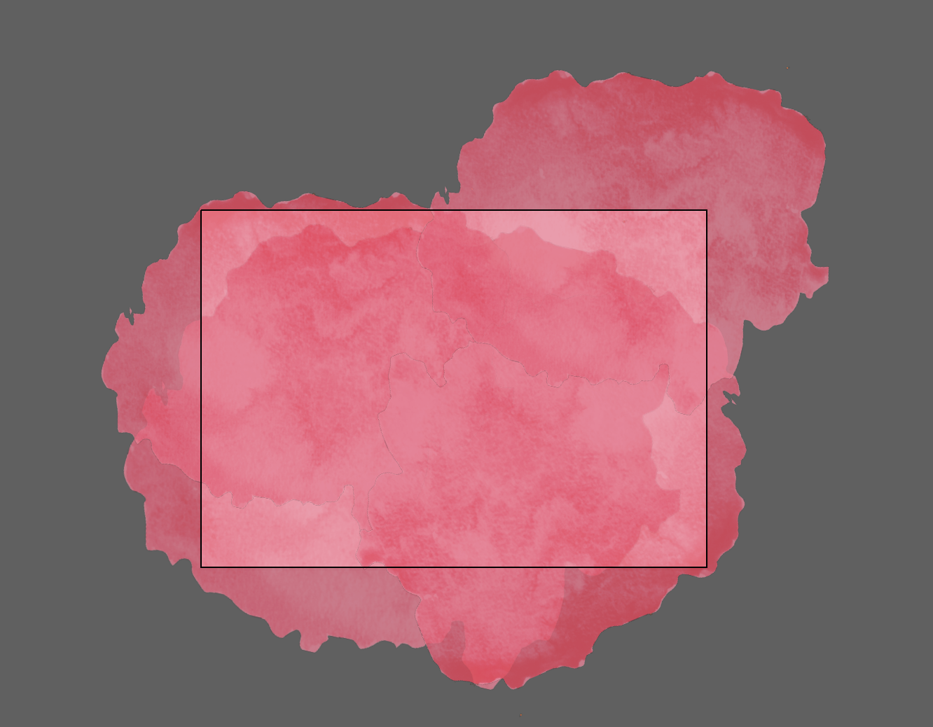
This is it layered in illustrator. I also played with the opacity of some to get a variety of tones and layering textures.
Resources: