
Draft 3
I think I have developed my type specimen well. Although my design ideas differ completely, I feel like this shows how my designs have evolved more and more to fit the brief of a modern type specimen.
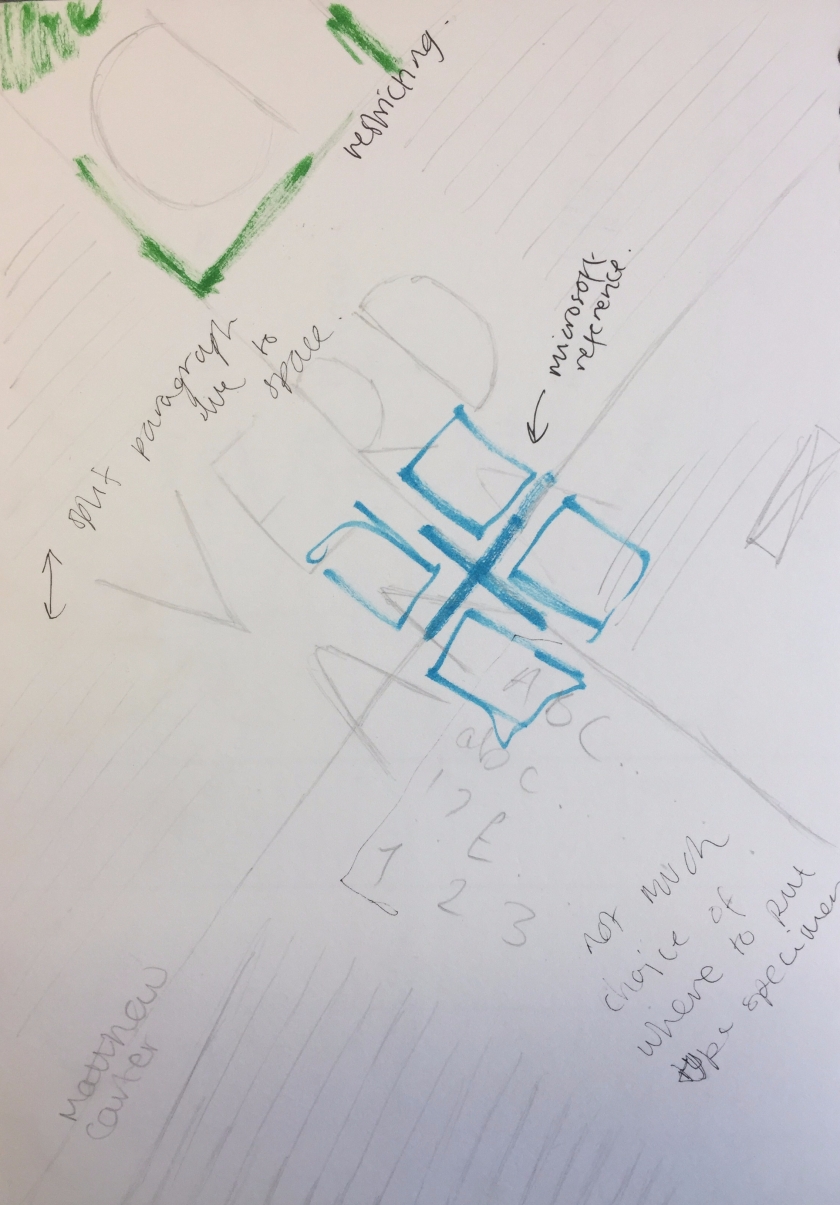
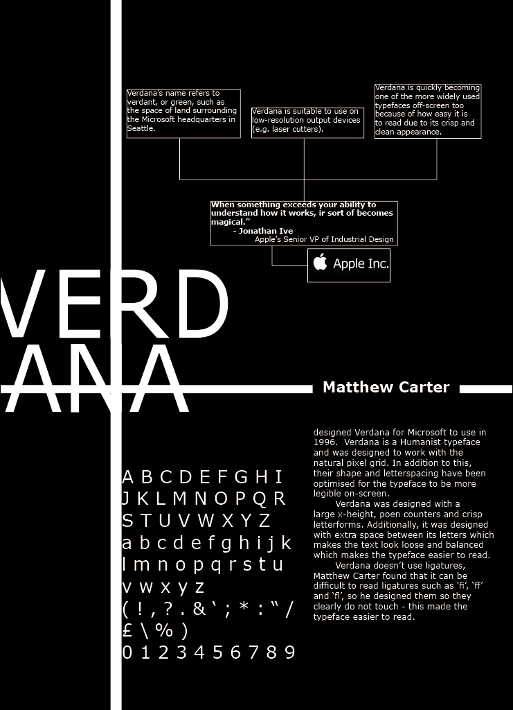
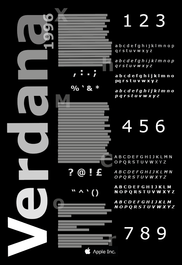
I chose to fade each letter of ‘Verdana’ to give the piece more depth, and in addition to this I also picked out letters to put behind each paragraph to add more depth and dimension.
I decided to split the numbers up to balance out the space; however, in order for the numbers to balance out the negative spaces surrounding the punctuation examples, I made the numbers larger. This draws the eye to the right side of the page, meaning the reader will view the actual type specimen first, and then follow the punctuation marks in the centre columns guide the eye to read the information in the middle of the page. Personally, I think this works quite well as it creates movement within the piece as it requires the reader to go against the standard way of reading (left to right).
I decided to show the alphabet in the different strokes and weights to show the reader why Verdana is a suitable font to use in the case of making a piece of text (whether online or offline) more legible.
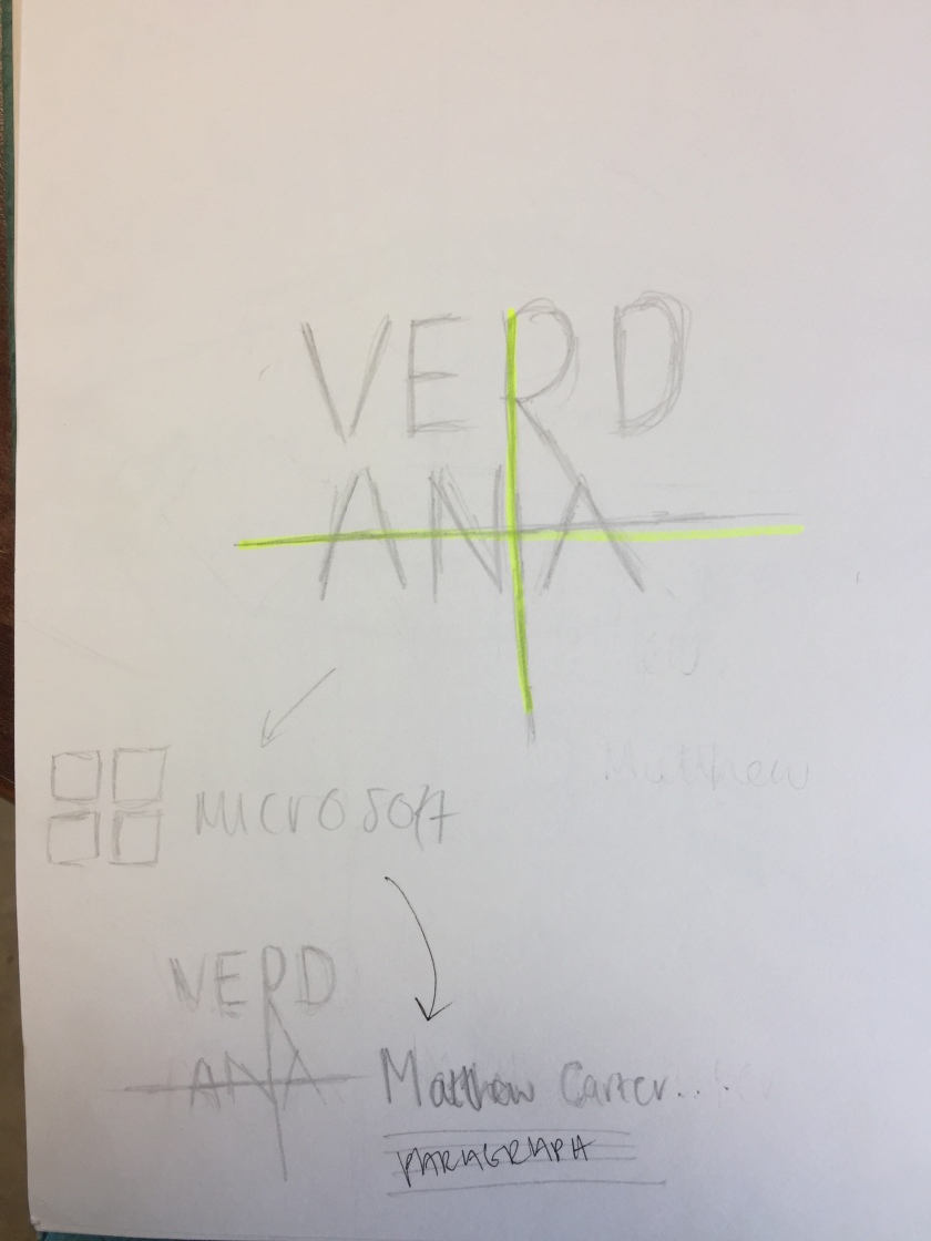
The reason I changed my type specimen so much from my second and third draft is because I felt that I restricted myself too much using grids and shapes to make the space more dynamic.